film poster analysis
blade runner analysis

I think that the film Blade Runner is most probably a Sci-Fi / action Film, this is due to the fact that there are buildings that are of future design and the bottom of the poster as well as a flying craft in the centre of the poster which clearly indicates some sort of futuristic theme. Furthermore, the bright lights in the poster is a clear factor that this is a Sci-Fi film because many Science Fiction films use bright lights to give away the genre of Sci-fi . Also on the right hand side of the poster there is a which looks a lot like an A.I which further emphasises the Sci-Fi genre of the film.For the story line, I think that the male protagonist (Harrison Ford) may have to face some sort of conflict between human world and artificial intelligence world which could bring in the action aspect of the film.The fact that there is both a male and female image on the poster there could be a subtle romance occurring which could further create complications as the female is an A.I. and the male is a human. This film was released in the 1980's which means the target audience may have been at least 16+ however as modern times have developed this film maybe suitable for 12+ , this is because more of the younger generation is being exposed to action and violence at a younger age so older films may not be as 'dangerous' to watch.
Scary Movie 2
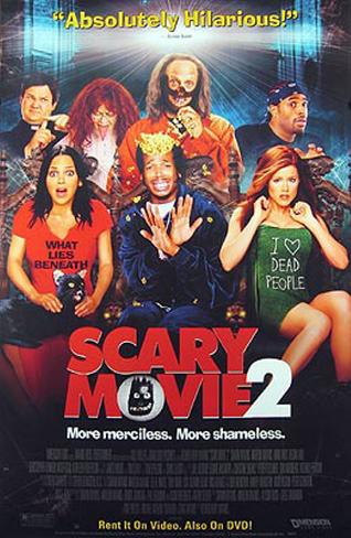 Scary Movie 2 is most likely going to be a parody/ spoof film of a generic horror film.This is evident in the characters. For example, the two women on both the right and left hand side of the poster have famous film quotes on their T-shirts such as "what lies beneath" and a parodied version of the film Sixth Sense's famous quote "I see dead people" which has been turned into " I love dead people" this shows intertextuality between really famous films and this one .These changes clearly implies that this film is not going to be a serious horror film but a comedic horror film. Furthermore, the bright colours, on the poster, could show the audience that this film is meant to be quite lighthearted and comedic.Also, the tagline (More Merciless,More Shameless.) under the title further shows the audience that the film is not a serious film and that they should be expecting to laugh throughout the film. The film's story line is most probably going to be a variety of horrors films that have been modified and put together into one plot to become comedic also the films protagonist's most probably will be stereotypical characters that have been exaggerated to add to the comedic genre of the film. With this information, I think that the target audience would appeal to teenagers because teenagers usually enjoy horrors yet they also enjoy comedy and this film is a mixture of both. Also, in many horror films teenagers are the main protagonist's so teenage audiences may be able to relate , to an extent, to the characters on stage.
UZAK
 Uzak is an international film which , by looking at the image on the poster, may be an tragedy or a drama film. This is because of the background image in the poster the landscape is quite deserted and quite abandoned which suggests some sort of emptiness and loss in the protagonists life. In Addition, the colours of the image on the poster are quite dull and dark which further emphasise the depressing and miserable aspects in the film. Furthermore the story line may be that the main protagonist needs to regain or repair his life from his recent loss/ tragedy, this is due to the fact that the image has snow in it which acts as a semiotic as snow is something that occurs in the winter and winter can be associated with misery, cold and negative things so the snow could show the misery the character is trying to get over. As far as target audience goes ,the audience may be targeted more towards people 15+ because it may show real situations that many people may face.
I'm Not Scared
Sin City
 Sin City is probably going to be a film in the crime and thriller genres. I am assuming this because of the red font of the title because the colour red has many connotations but in the case of the word Sin in Sin City the red could suggest blood and gore which leads to the fact that this film is in the crime and or thriller genre. Furthermore, the film posters colours are quite dark as there lots of greys and blacks and it seems to be raining in the image which could instantly suggest a depressing, mysterious or serious film for the audience to expect. I also think this film is quite violent because of the guns the characters are holding in the image which further emphasises the crime and thriller genre . The story line of this movie may be that the protagonist of the film needs to solve a murder mystery but then uncovers more secrets that are to do with the city (sin CITY) he lives in and how that links to the murder of which he solves. The target audience depends on the level of violence and strong language so i think its at a 18+.
 pirates of the Caribbean
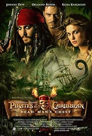 pirates of Caribbean is definitely going to be a adventure/fantasy film because of the big pirate ships in the background of the image as well as it being set sometime in the 18th century.What also gives this away is the colours in the image which are quite deep and have golden under tones and royal reds and greens. also the font of the title is quite serious and bold which further suggests this film has action in it. Pirates of the Caribbean probably has a typical adventure storyline where the protagonists must go on a journey to retrieve something or defeat an evil figure in their world and maybe a possible romance with Orlando Bloom and Kiera Knightly. Lastly the target audience is probably 12 because its most likely mild violence and mild language.
 Bride and Prejudice
 bride and prejudice is most likely going to in the romantic comedy genre as suggested by its name which is a form of intertexuality with the popular book Pride and Prejudice, because of the male and female who are most likely going to fall in love, however in the image there are the, what seems to be, families of the two protagonists which may cause some conflict between them as they both are clearly from different backgrounds. What else that gives the fact that the film is a rom com is the bright colours and the ratings which emphasizes to the audience that this is going to be a light hearted,funny and positive film making this film a PG rating for the audience because there shouldnt be any strong language and or violence in this specific film
 Million Dollar Baby
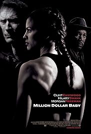 By the film poster the film Million Dollar Baby could possibly have the protagonist as a female who may have to train to fight a (modern) battle where the other two male characters ,present in the image , must help train her. From what i can see in the poster this film could possibly be in the drama genre of film. Lastly, i think the target audience is going to be 12+ with mild language and mild violence
Comments
Post a Comment